This project consisted of redesigning two user flows, sign up, and onboarding for a client's app*. A personal walkthrough and user research pointed to these as the weakest points. I built a new icon set and color palette from the app's existing branding, then designed an entirely new journey across Light and Dark Mode. View the full prototype in Figma.

*Due to an NDA with the client, the app name and logo have been changed. The design process and research shown are unaltered.

pinetree app design

roles
app designer, illustrator, prototyper

programs
figma, illustrator

timeline
november 2024 - february 2025

Overview of Light Mode Journey

Overview of Dark Mode Journey

Error Pages

phase 1:

research

user interviews:

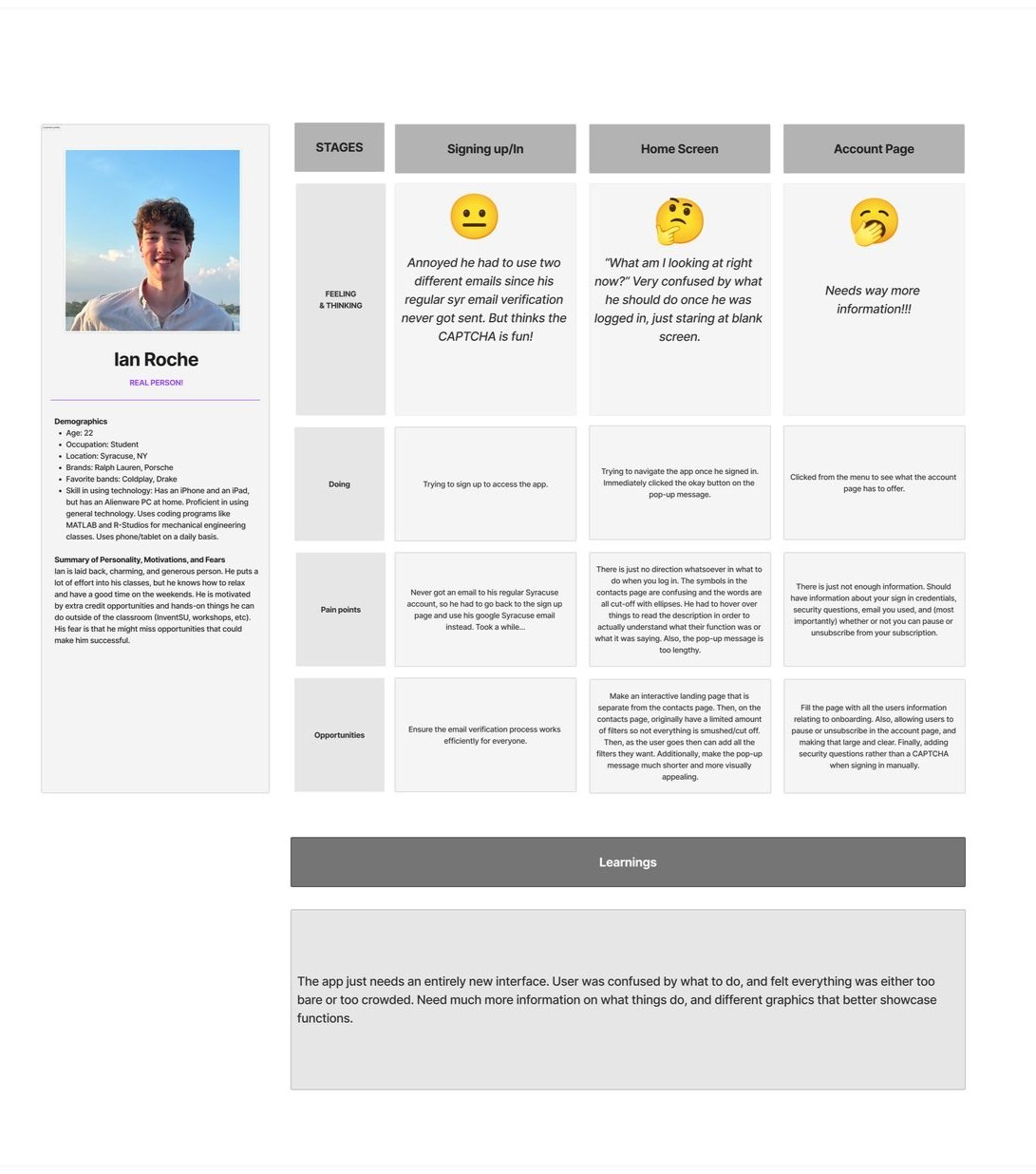
I watched four people navigate the app and interviewed them on what they liked, disliked, and what would motivate them to use something like it.

User persona profile for Megan Radakovich, detailing demographics, personality, motivations, and fears alongside stages of entering personal info, loading screens, and signing in, with associated feelings, thoughts, actions, pain points, and opportunities.
User persona and journey map for app interface redesign, featuring stages of signing up, home screen interaction, and account page issues, with feedback on improving user experience.
A persona profile for "Robert Lanfrank" alongside a user journey map detailing stages like "Landing page," "Adding Contacts," and "Adding Interactions," including feelings, actions, pain points, and opportunities.

competitor analysis:

I researched four competitor sites and apps, looking at what made them successful, where they fell short, and what PineTree could offer that they couldn't.

Comparison chart featuring company logos and sticky notes outlining unique value propositions, advantages, disadvantages, similar capabilities, apparent differences, key learnings, and opportunities for LinkedIn, Clay, and another company. Includes sections for identifying unique aspects and areas for growth.

phase 2:

ideation & wireframe

Impact-effort matrix with sticky notes listing different app features. The horizontal axis indicates effort (low to high) and the vertical axis indicates impact (low to high). High impact and low effort ideas include features like signing up with phone verification, eliminating sign-in processes, and using Face ID. Other notes explore guest accounts and QR code sign-up.

defining the problem:

I started by writing POV statements naming each pain point, then I reframed them as "How Might We" questions. Those questions became potential solutions, which I placed on this effort/impact matrix to decide what to build first.

Diagram showcasing app design notes for marketing, sign up, verification, landing page, and menu. Each section includes app interface mockups with red numbered annotations and corresponding detailed notes. Designed to provide guidance and suggestions for improving user experience and functionality across different stages of the app.

wireframing:

High-impact, low-effort solutions became an annotated wireframe covering marketing, sign up, verification, landing, and menu flows.

phase 3:

design & prototype
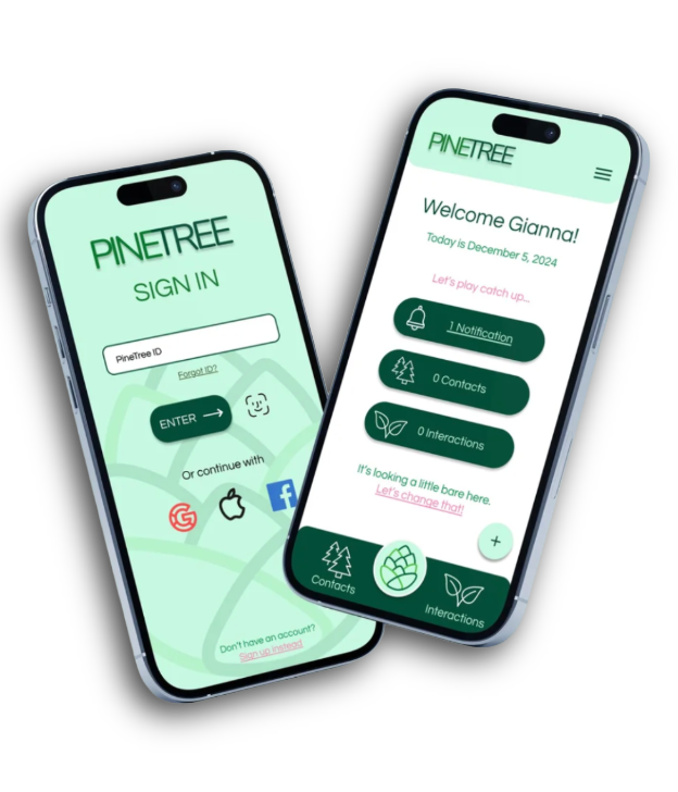
final system:

After class critique and several rounds of client feedback, I built out the final design system: icons, color palette, and a full Light/Dark Mode prototype in Figma.

Previous
Previous

empower parkinson redesign

Next
Next

butterfly cove inn