This is Ginzing: a non-caffeinated, sugar-free energy tea. Ginseng boosts cognitive function and energy levels, without raising insulin or causing dehydration. With three tasty flavors and essential vitamins, this tea gives long-lasting energy without the midday crash. Skip your morning coffee, and have a Ginzing tea instead.
ginzing energy tea
roles
package designer, researcher, copywriter, brand developer
programs
illustrator, indesign, photoshop
timeline
january 2024 - march 2024
phase 1:
concept iteration
first iteration:
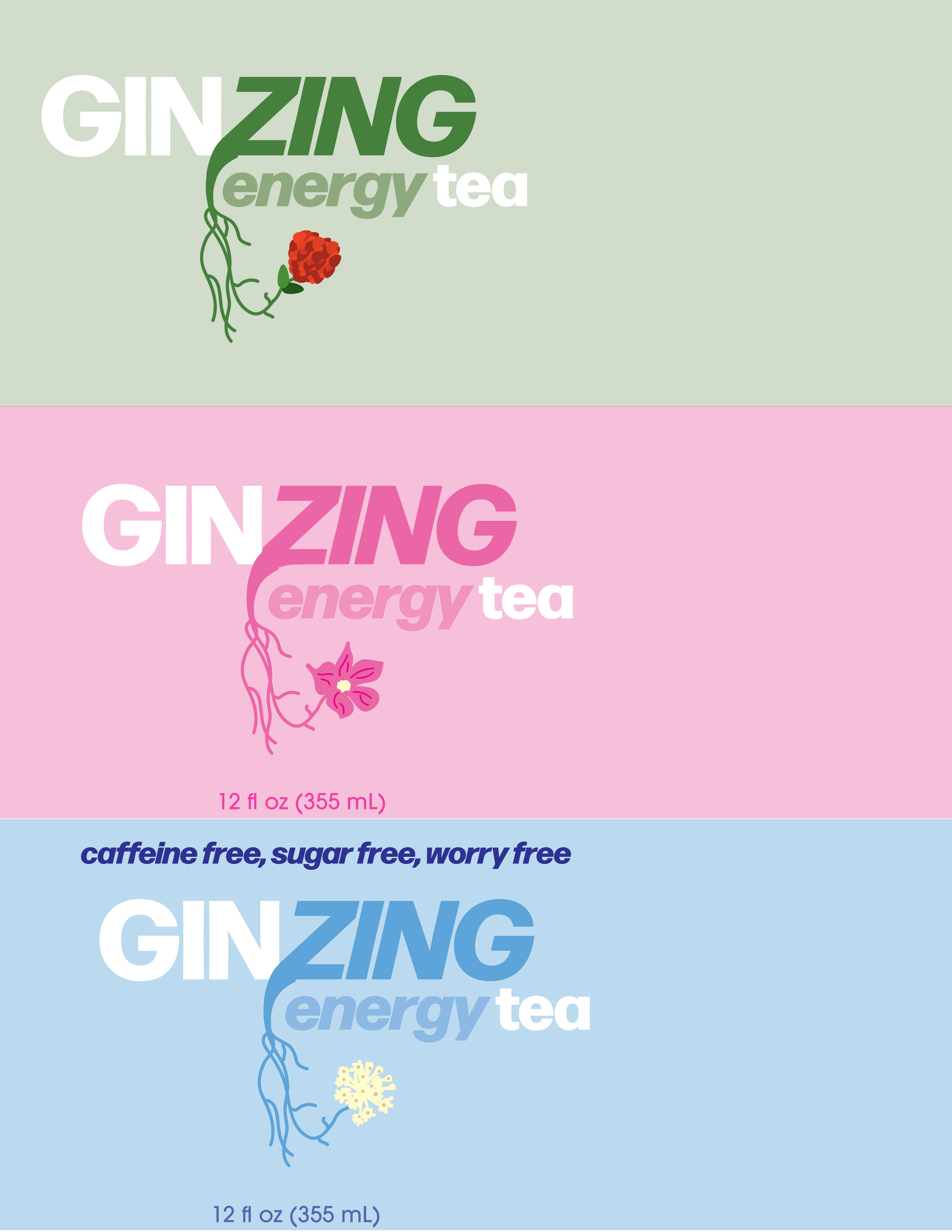
My first draft used illustrated ginseng flowers with roots and a heavier typeface. The roots read as droopy rather than energizing, so I moved to a new direction.
second iteration:
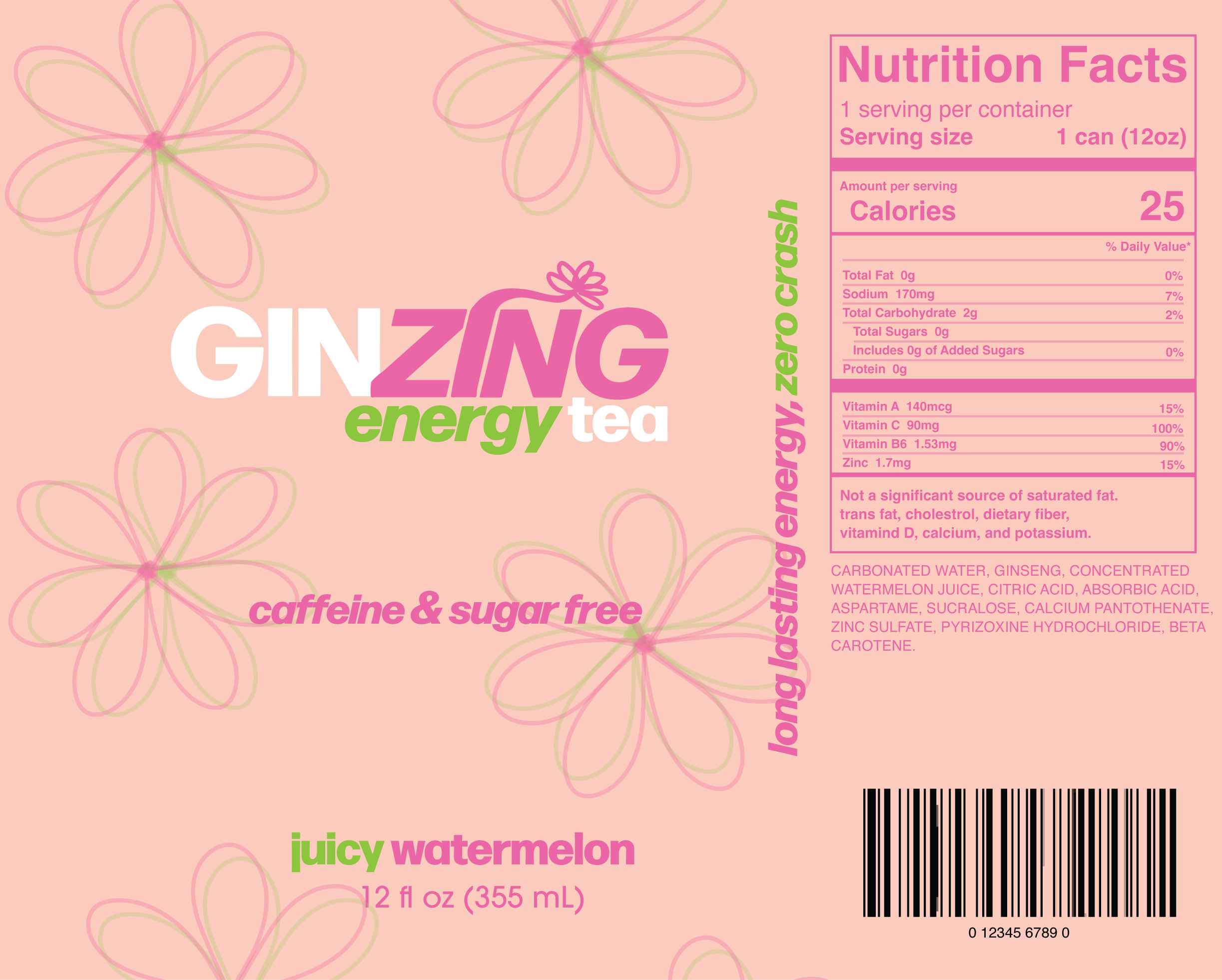
The second version simplified the flower into a single 3D-style lotus emerging from the "i." But "Gin" read too prominently on its own, risking confusion with alcohol, and the flower still felt disconnected from the wordmark.
final design:
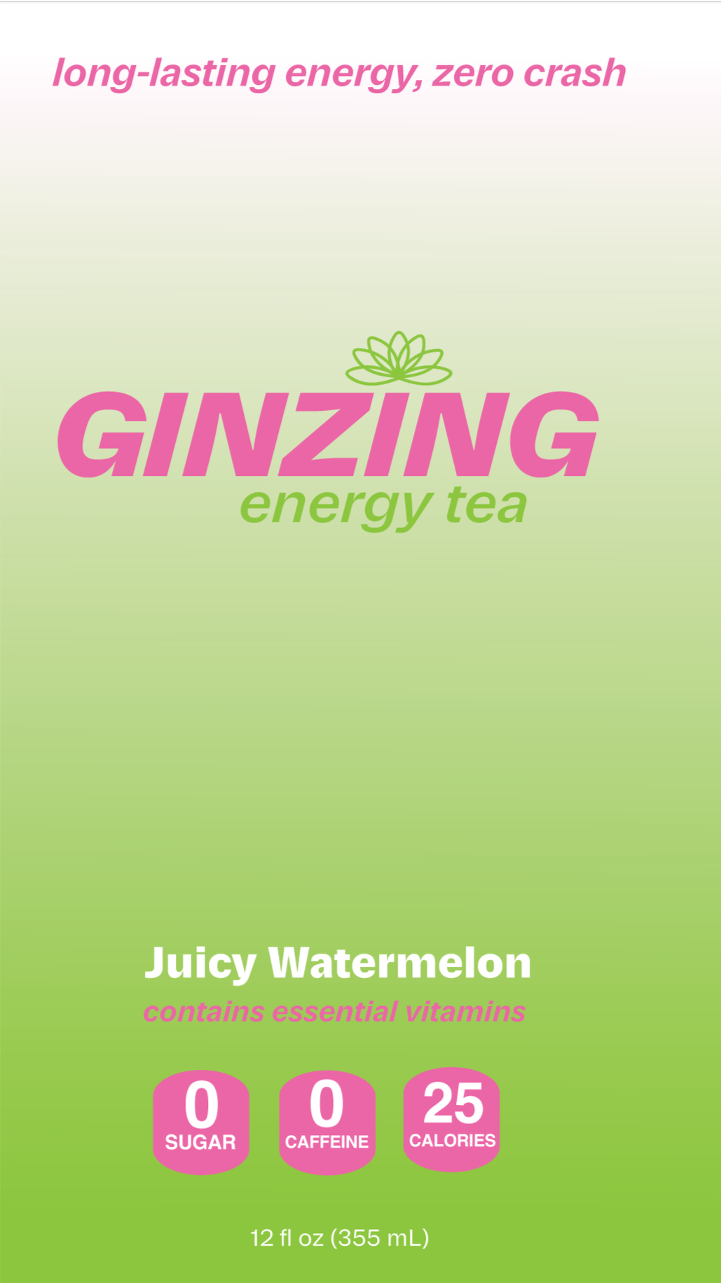
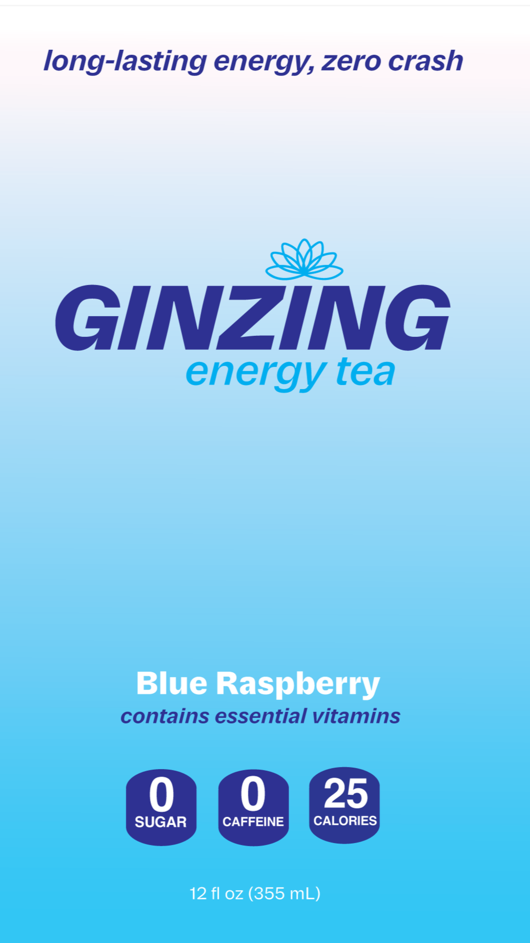
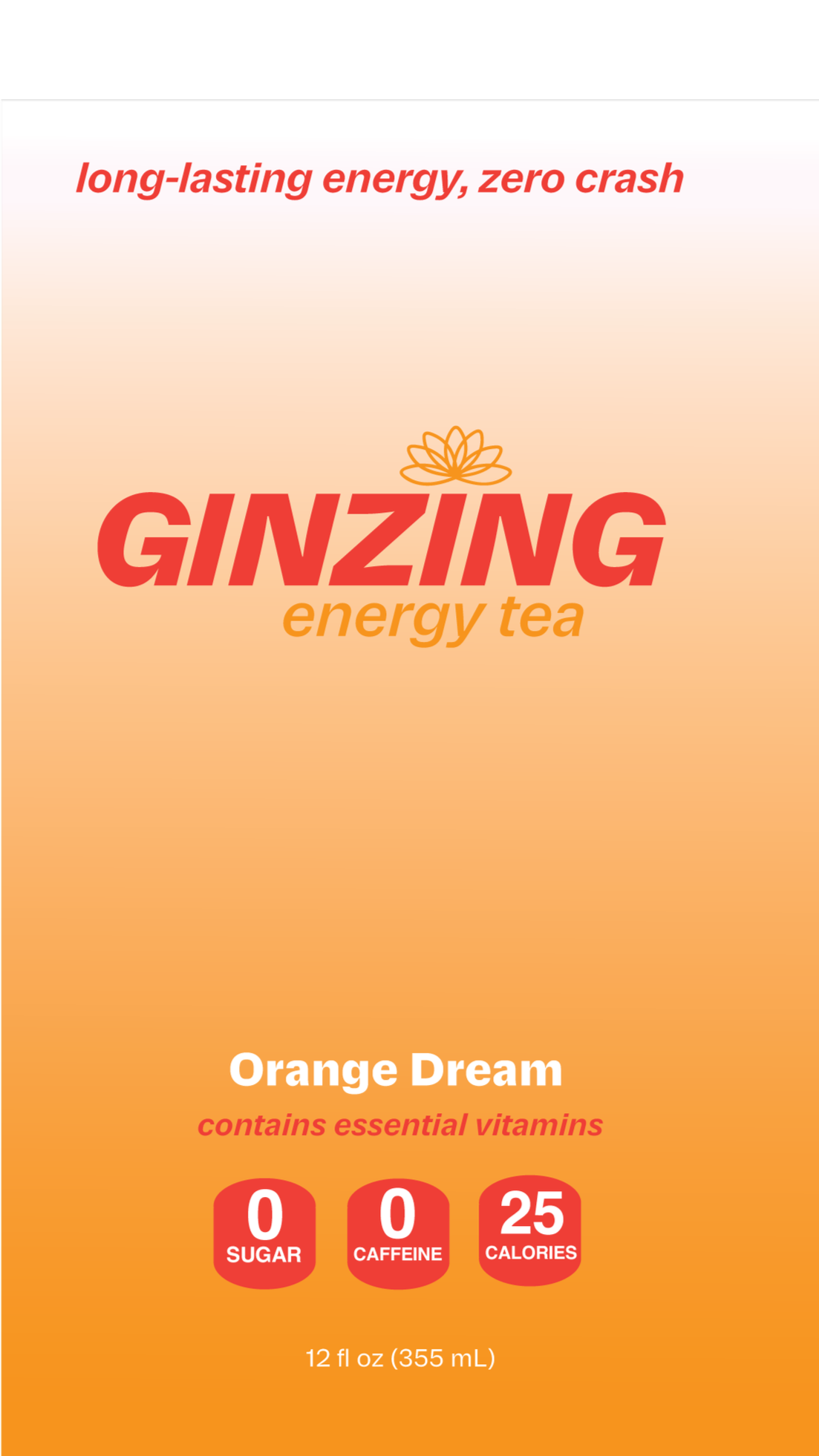
The final direction went modern and simple: gradients replaced the pattern, "Ginzing" became one color, and the lotus flower moved to sit permanently atop the "i." This became the strict rule for the finished system: the flower can only appear behind or atop the “i”, and the logo can never tilt or run in black.
building out the system
phase 2:
stationery:
Business cards keep the full lockup, "Ginzing energy tea," since they need the extra context. Letterhead and envelopes drop "energy tea" for a cleaner mark, per the brand's own lockup rules.
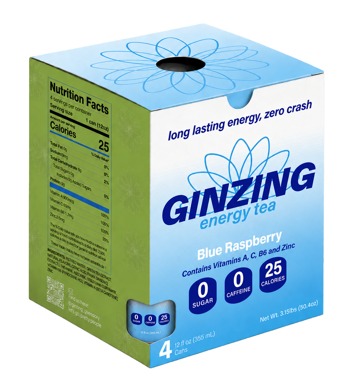
box & labels:
Business cards keep the full lockup, "Ginzing energy tea," since they need the extra context. Letterhead and envelopes drop "energy tea" for a cleaner mark, per the brand's own lockup rules.
marketing & activation
phase 3:
ad & giveaway item:
The ad leans into Ginzing's core pitch, energy without the crash, paired with an active lifestyle shot to sell the feeling rather than just the ingredients. A branded yoga mat giveaway drops "energy tea" from the lockup, per the brand's own rule for giveaway items, and ties the product to the same active, energized use case as the ad.
outcome
Ginzing became a full branding system built from one central idea, energy without the crash, carried consistently from can to campaign through a documented set of logo, color, and layout rules. Final deliverables include packaging, stationery, a retail box, a print ad, branded merchandise, and a full brand guidelines document.