The goal of this project, completed in a UI/UX class, was to redesign 1-2 user flow’s of a clients’ app. I focused on Sign Up and Onboarding, as I found through a personal walkthrough and user research that it had the most issues. I took inspiration from the current branding system to create icons and a color palette. Then, I focused on user pain points to curate an entirely new journey — including Light and Dark Modes. Finally, I prototyped the design into a working app. You can view the entire project here: https://www.figma.com/proto/yY2uQzObnONto2F2TG9HJU/Lanfrank-PineTree?node-id=0-1&t=bL3bkA5XKVa9Ufyz-1
PineTree App Design
Roles
App Designer, Illustrator, Prototyper
Programs
Figma, Illustrator
Timeline
November 2024 - February 2025
Overview of Light Mode Journey
Overview of Dark Mode Journey
Error Pages
I started off by doing a content audit of the current app. I can’t show that here since the app has yet to be released, but using this information allowed me to see exactly what a user experiences; and helped me to connect the pain points to specific content. That is where my user research began.
Process
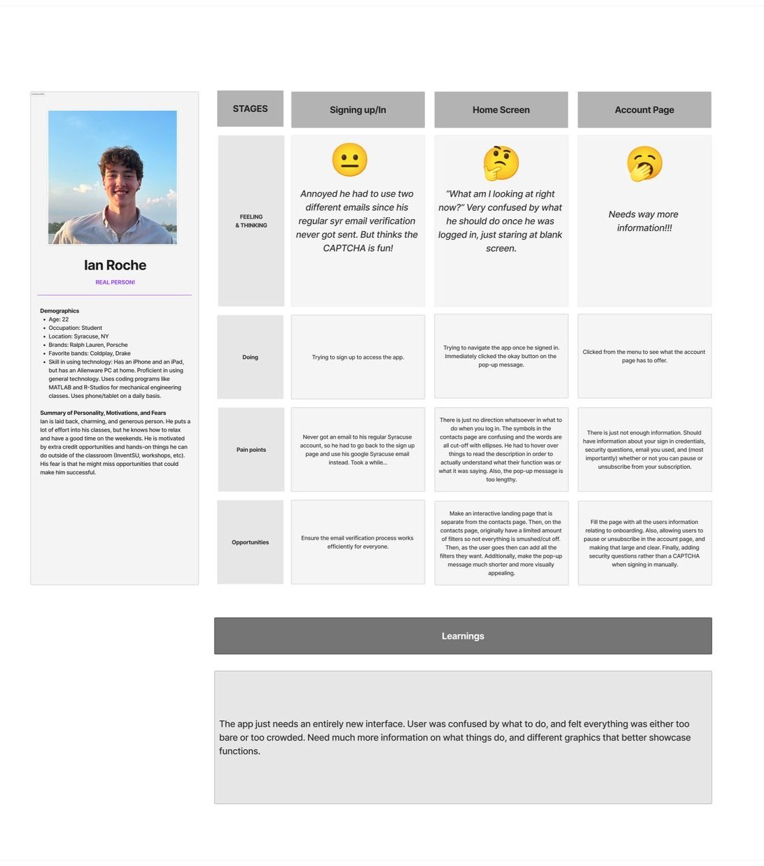
Phase 1: Research
I watched 4 people move around the app and wrote down what they liked/disliked. I also interviewed them about the apps functions, and determined what would motivate each person to use something like this.


I also ran a competitor analysis and found four other sites/apps like PineTree. I looked into what functions made them successful, what they lacked, and what PineTree could offer that would make it unique.


I took my findings from Phase 1 and began making POV statements that highlighted pain points and missing elements. Those led me into “How Might We” (HMW) statements, aiming at determining how those certain points and elements could be framed into a solution. Then, I placed those solutions on a prioritization matrix (below) to determine the effort and impact of each solution. This translated into making an annotated wireframe.
Phase 2: Ideation & Wireframe


Phase 3: Design & Prototype
Following class critique, multiple meetings with the client, and weeks of refinement, I came to a final design. I took inspiration from the current app to create icons, a color palette, and an entire design system. Here is a picture of my thorough prototyping (if you can’t tell, I had a lot of fun!).