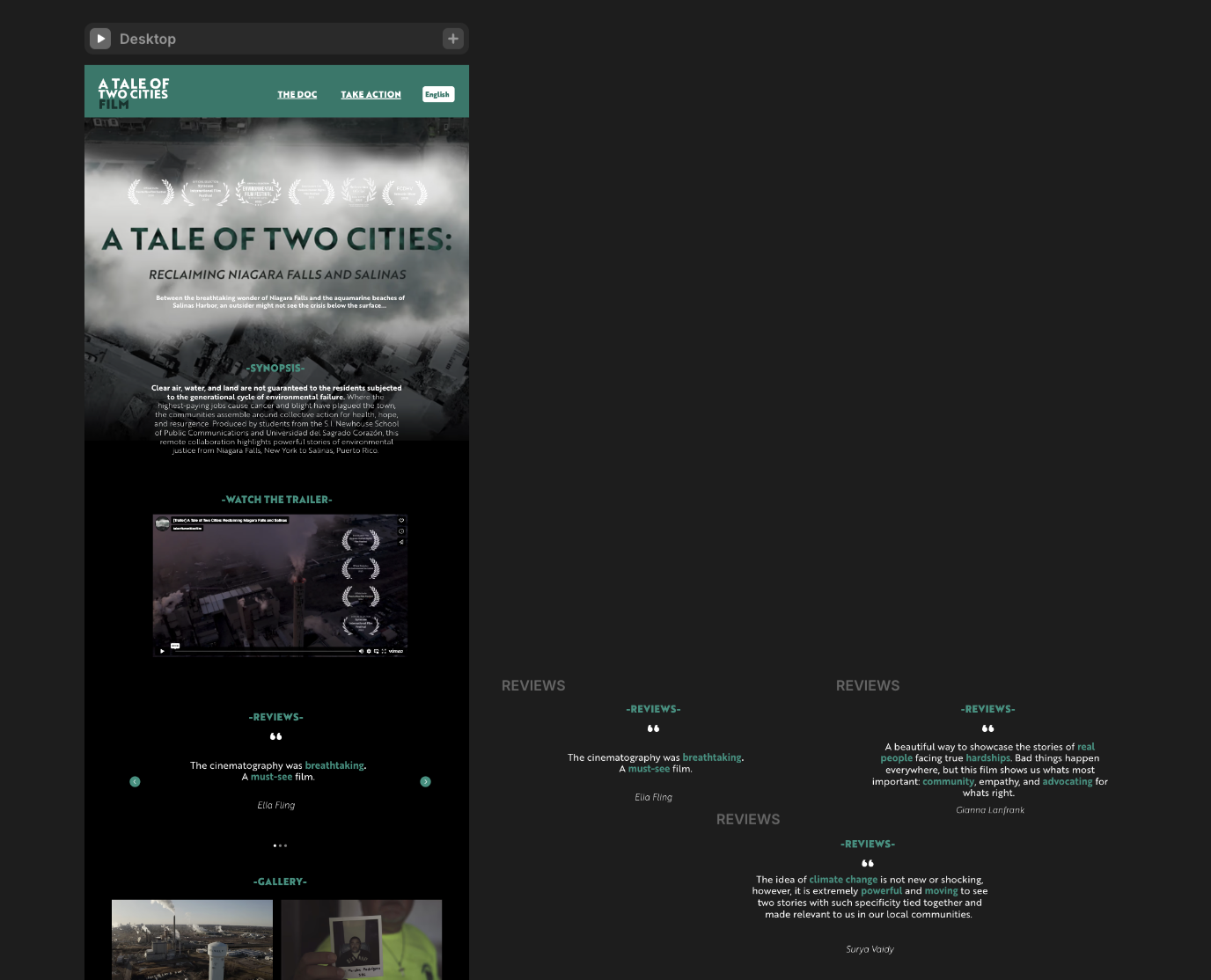
The project began with a clear goal: to build a platform that could grow alongside a documentary on environmental injustice in Niagara Falls and Salinas, Puerto Rico. My client, a student filmmaker, had reached out for help in regards to building that platform. She needed a website that could do a little bit of everything: host a trailer, showcase behind-the-scenes footage, share press coverage, and eventually grow into something more.
A Tale of Two Cities Film Site
Roles
UI/UX Designer
Programs
Figma, Illustrator, Photoshop, Framer
Timeline
March 2025 - May 2025
Process
In our first meeting, we sketched out a long wishlist: a homepage with embedded video, space for behind-the-scenes content, a “next screenings” section with laurels front and center, and a dedicated “in the news” archive. She also wanted room for future collaborators’ work—stories that extended the documentary’s impact—and a clear call to action that answered, “What can people do next?”
Phase 1: The Brief

We talked about structure (should this be one page or multiple?), gallery styles for stills and BTS, how to highlight team bios, and even a plugin to support Spanish translation down the line. A wordmark was a high priority, while a poster and domain connection could wait. After the meeting, she shared a document with written copy and login access; and I got to work.


I started in Figma, organizing the content from the hard drive and drafting a layout that gave visual weight to the trailer, laurels, and call-to-action. I used the sections my client and I discussed to structure the entire site, balancing them with text, images, trailers, and live reviews. I originally started making multiple pages before discussing the desire for just a landing page, so I had to switch gears once I learned of my new task.
Phase 2: Design & Develop

Once the one-page layout felt solid, I transferred everything onto Framer to build the final desktop experience. Framer’s flexibility let me fine-tune microinteractions and scroll behavior, and quickly prototype how everything moved and layered on the page. I made room for (eventually) headshots, embedded galleries, and scalable layout sections so the project could grow over time without feeling crowded. This was my first time using this platform, so a lot of my time was also taken up by watching tutorials and trial-and-error.

The Outcome
The final site is a fully responsive one-page desktop experience that prioritizes the heart of the film: the people behind the story and the ongoing work it inspired. With embedded media, organized sections for reviewers, and a structure built for expansion, it gives the film a digital home that feels intentional, honest, and ready to grow.
*I recommend viewing from your desktop.
Click here to go to the website!
